My progress during the 10-week collaboration with Harbor Picture Company, Electrical Theatre Collective, and Calling All Talent.
(Most recent progress at the top)
TO-DO:
FX References Find + Film
Begin Embroidery FX
Begin Cloth Transition FX
3D Previs
Jan 18, 2026
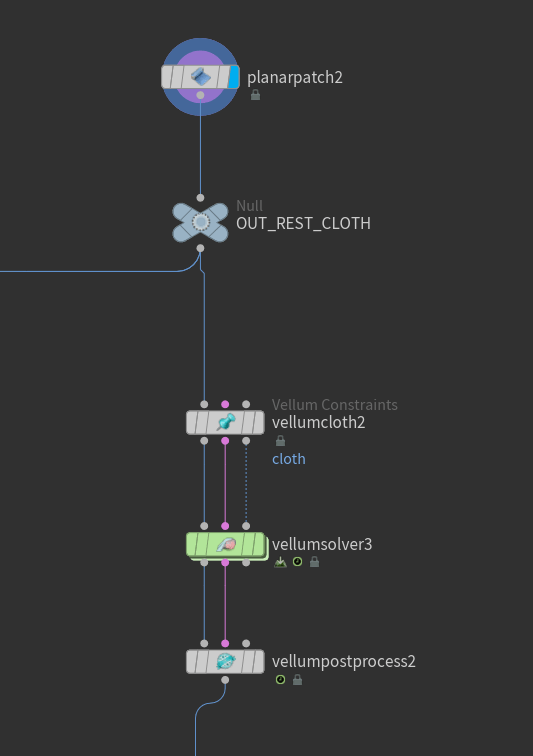
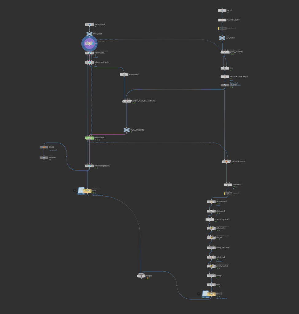
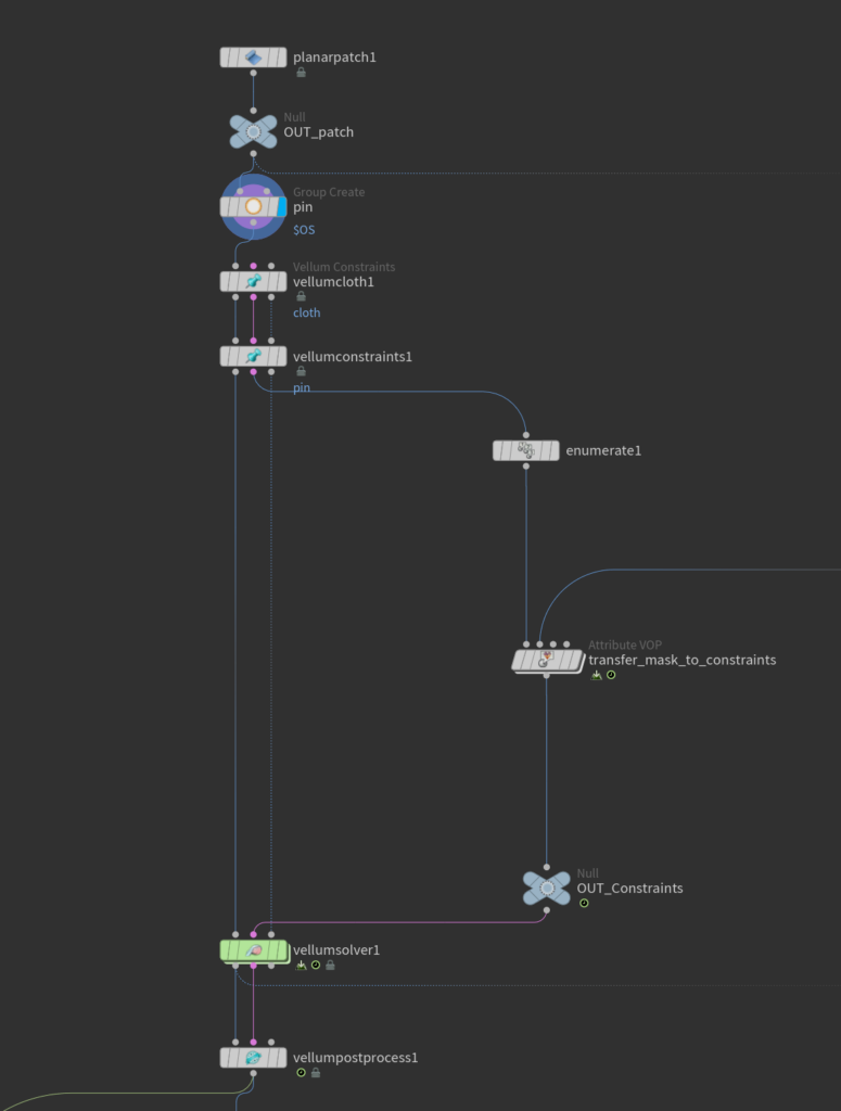
Cloth FX – Shot 3
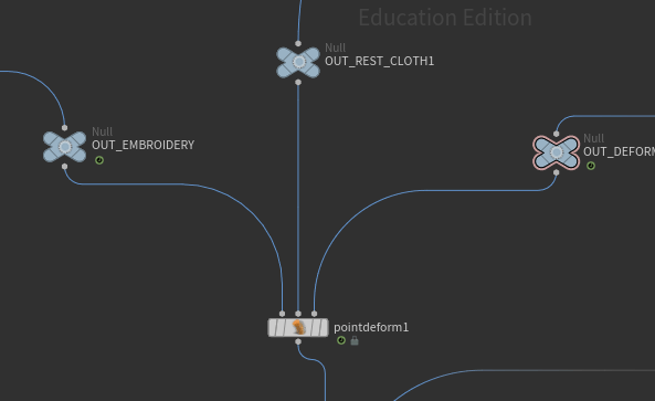
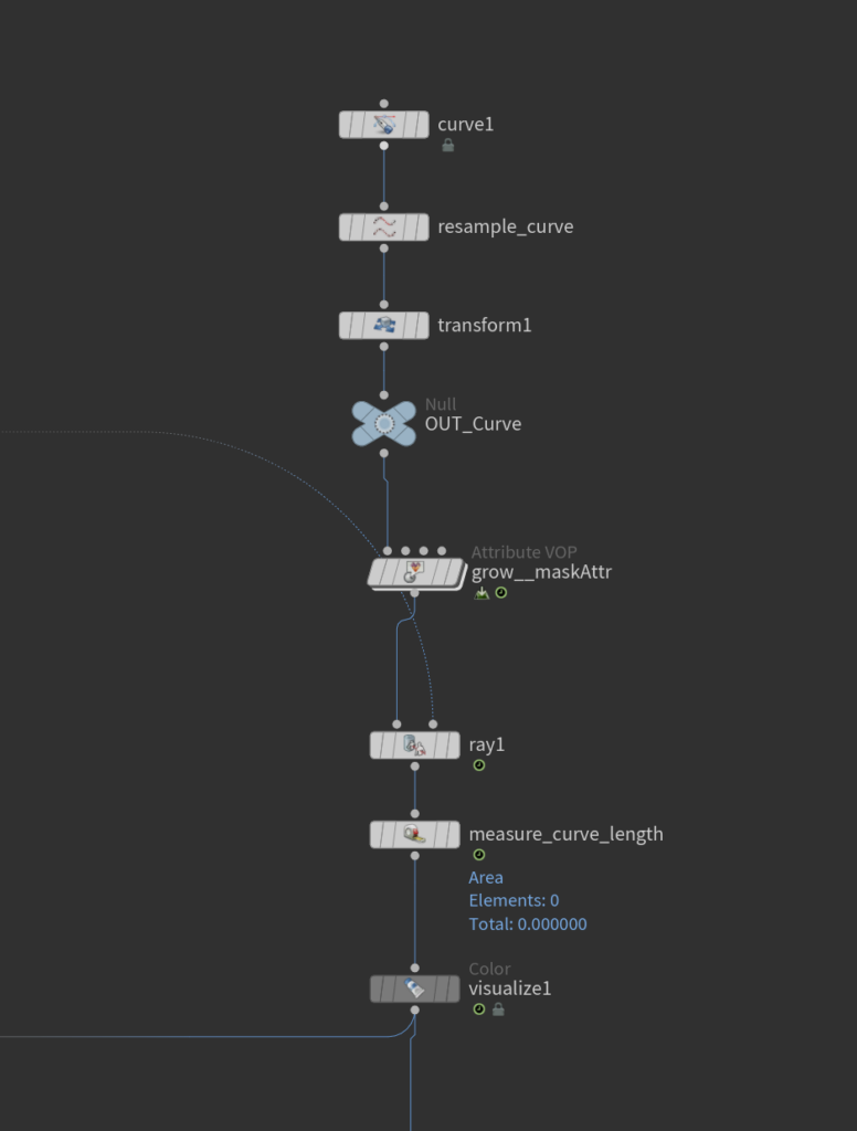
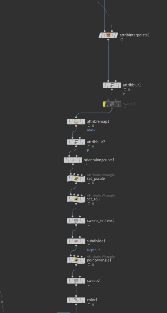
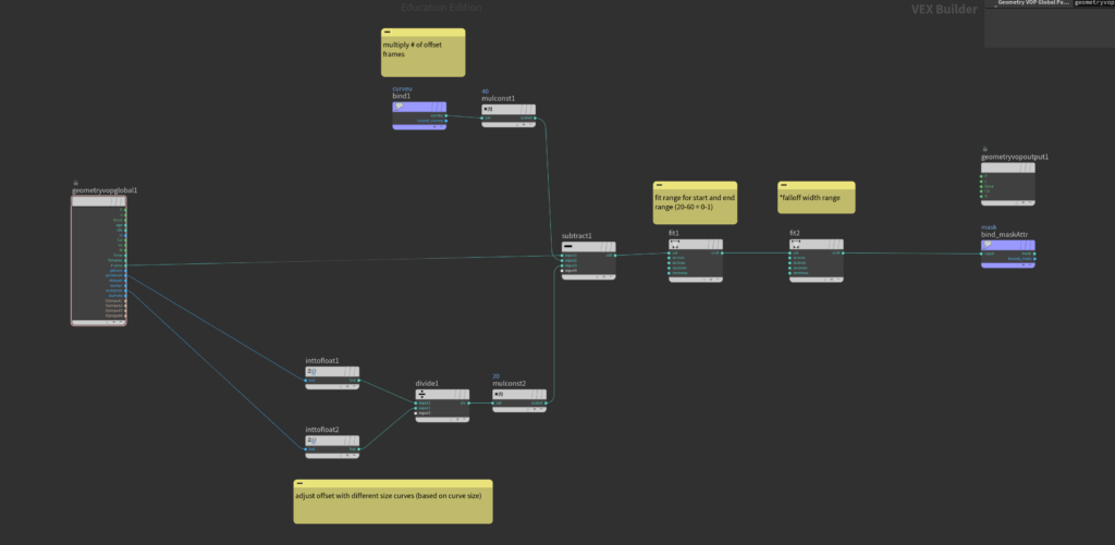
Embroidery – Shot 2
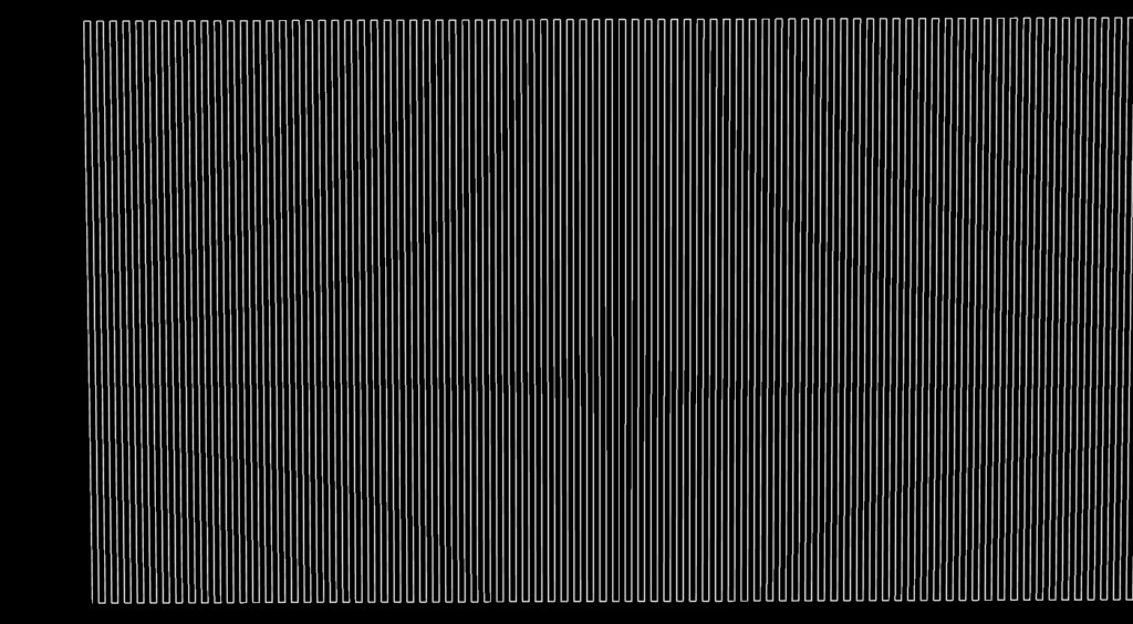
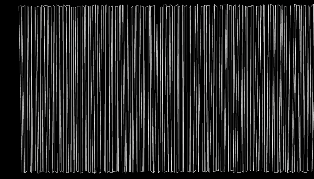
Embroidery Set Up:
Used grid + group by range to create a zig-zag pattern
Added random scaling for broken-up edges
Subbdivide
Carve Node to control timing of curve moving
Sweep
Point Deform for the curve to follow the movement of the simulated cloth
Embroidery Shot Framing:
This week, I was experimenting with the cameras for this shot:
Jan 16, 2026
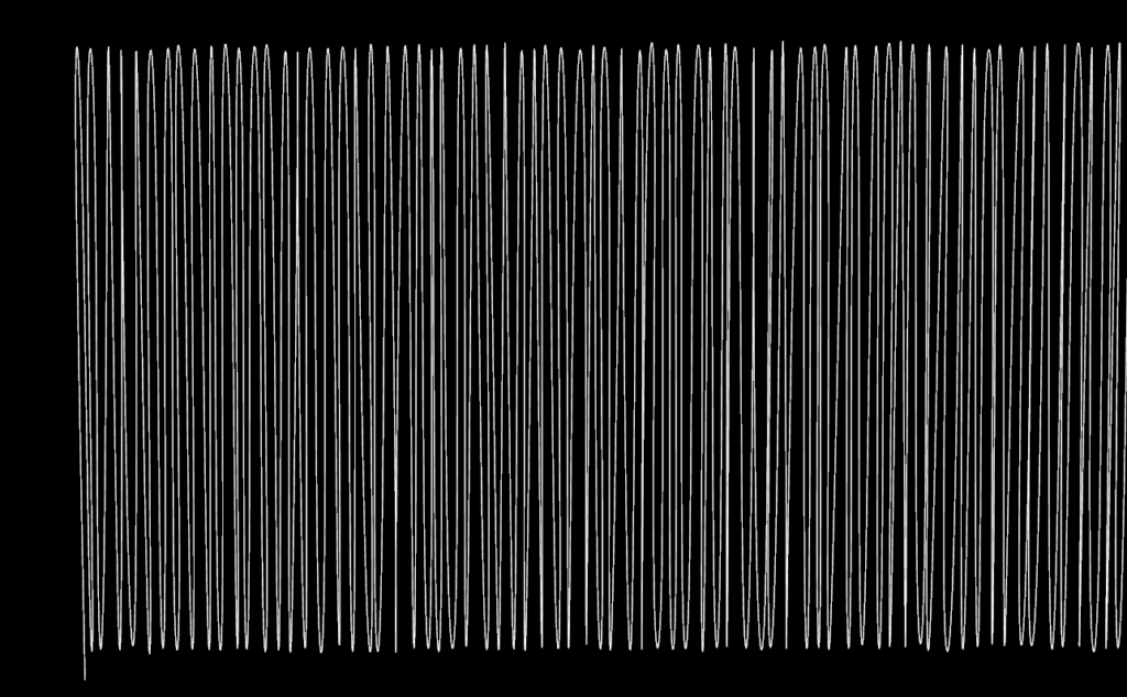
FX Tests – Vellum
Vellum Testing
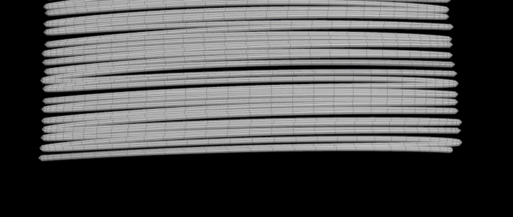
I haven’t worked with vellum much in the past, so I’m excited to start the cloth shot and learn as I go
Last week, one of the notes given by the mentor, Beck, was to make sure that the behavior of the cloth is accurate, so I wanted to really get an understanding of how each parameter affects the behavior of the cloth
Tests of different parameters in Vellum cloth constraints to compare with each other:
Cloth tests with various resolutions and stretch constraint values
Cloth tests with various stretch constraint values and bend constraint values
Cloth tests with various stretch constraint values and bend constraint values
After analyzing the reference I’ve gathered this week, I think that the lower bend stiffness and medium to high resolution result in the behaviour closest to a soft bedsheet because of the wrinkles and folds it creates.
Jan 15, 2026
Previs/FX Tests
Cloth Previs:
Medium shot of cloth waving to use as a transition from the close up embroidery to the wide hotel room shot
Using vellum solver
Jan 14, 2026
FX Reference and Tests
FX References
Some cloth references that Mia and I filmed using a bed sheet, to better understand the behavior of this type of cloth:
From Getty Images:
FX Test – Embroidery
Since we are going to be so up close to this shot, I will have to continue experimenting with new methods to get a detailed result. I would like to look into using a small groom to also help this shot feel realistic!
Created a curve to follow and an attribute for the string to grow.
Add thickness and twisting to curve.
Ceate “grow” attribute to affect when the stitching starts over the curve.
Previsualization/Shots:
Last week, the mentors mentioned staying true to the brand, so I wanted to explore what the commercial would look like with the clouds playing a smaller part and instead, emphasizing the brand’s luxurious and sophisticated image, with more neutral colors and lighting
It would be better to reference ads that this brand has done directly and look into things like the environment of their store to learn more acout who they are as a brand
Also wanted to make the beginning shots more macro, to emphasizze the quality and craftsmanship of the brand
Shot 3 Previs:
Transitioning to the hotel room
Original – Clouds fill the screen
I think using cloth to transition will make more sense for the brand
Jan 13, 2026
Feedback – Pitch
Feedback from Mentors:
Kyle:
The jump between the two color palettes is too jarring
Maybe include oranges in the cloud color palette and purples in the hotel room with the orange color palette
Pinks are too saturated/blown out (Look for more muted references)
Bay careful of color spills on actor’s clothes during bed shot (use neutral colors, like grey)
Beck
Be careful with using bright, saturated pink in the color scheme when filming live action scenes
Make sure the vellum simulations behave like real life references of bed sheets
Stephan
The live action integration with the CG cloth sim during the laying down scene will be difficult to get right, so do some quick test footage as soon as you can to make sure it is possible
Billy
The bright pinks and purples in the lighting will cause the white bedding to look pink, which may take away from what the brand is actually trying to convey
Feedback from Professor Fowler and Professor Gaynor:
The two different lighting references for the different environments are too contradicting and feels a little bit jarring
Team Tasks and To Do List:
The most common feedback from this week was to gather new lighting references, as the current ones we have feel to jarring and take away from the sophisticated and neutral tone of Boll & Branch
Do quick shoot of a live action person interacting with CG cloth